
The sophomore album. The second go. The sequel. There seems to be a lot of stigma attached to the follow-up of a successful debut. Film directors panic, musicians go into meltdown. Why is the next iteration of something so stressful?
I sort of get it. Although let’s not kid ourselves here, we’re talking about a moderately successful launch of a watch from a very new company, but the Lomond resonated so well with so many that soon the cries of “when is the next one?” were quick and deafening. Even to this day, a year after retiring the Lomond collection, we still get enquiries on a daily basis about this beautiful watch. The temptation to reignite production was palpable, but one of the reasons the Lomond was so special was its limited run of only 1,000 pieces in total, ever. Therefore it remained, reluctantly, a no-go area for us.
The Atlantic project didn’t start as a Chrono, or for that matter called the Atlantic. It started as a railroad style watch using the Miyota 8218. The idea was to have a symmetrically arranged dial with a sub-6 second. I fancied the idea of having an internal rotating bezel, much like a compressor style watch, but without the diver aspect. Around four months later I had a technical document prepared and lovingly sent it off to our Japanese manufacturer for thoughts. A slow, painful death ensued as each design element was bounced back as unachievable or unworkable. The date window, as I’d positioned it at four o’clock, wasn’t achievable because the date printing wasn’t customisable and thus the numerals would sit at a peculiar angle. Furthermore, having the sub-seconds wheel positioned at 6 meant that the date, for some inexplicable reason, wouldn’t sit precisely at 3 o’clock either. Instead it sat at a nicely jaunty 4.1613°, or in layman’s terms, squint. The compromise therefore was either to have the sub-6 wheel just off 6 o’clock, or have the date window and numerals drunk. No dice.
It’s a shame when things like this happen; the assumption that we designed things to follow whole numbers and angles. I would assume that all movement manufacturers want conformity and alignment in their offerings, to allow people like me to easily adapt and specify their products. Yet here we are, with what you’d assume to be a “sure thing” in the watch world; that people like a sub-6 wheel and date window that’s straight. Yet because of this issue, we moved on from using that movement, and it’ll sit on Miyota’s shelves for longer, unfulfilled and unused. I note now actually, 3 years on, that the Miyota 8218 is discontinued. If only they’d sorted those angles out - there will likely be a very sound and mechanical reason for this arrangement, but like I said - unfulfilled and unused.
The elephant in the room was outed - what if the concept was applied to a Chronograph layout? Thoughts turned to what movement to use, what dial layouts we could adapt and, crucially for the project, what to call it now. The second coming of a chronograph isn’t to be sniffed at, so we wanted a name that conveyed the vast undertaking it would require. As luck would have it I had planned a trip down to East Fortune, which you can read more about in this edition, to see what inspiration I could find for an aviation watch design I had boiling away within me, and maybe, just maybe, stumble upon a golden nugget.

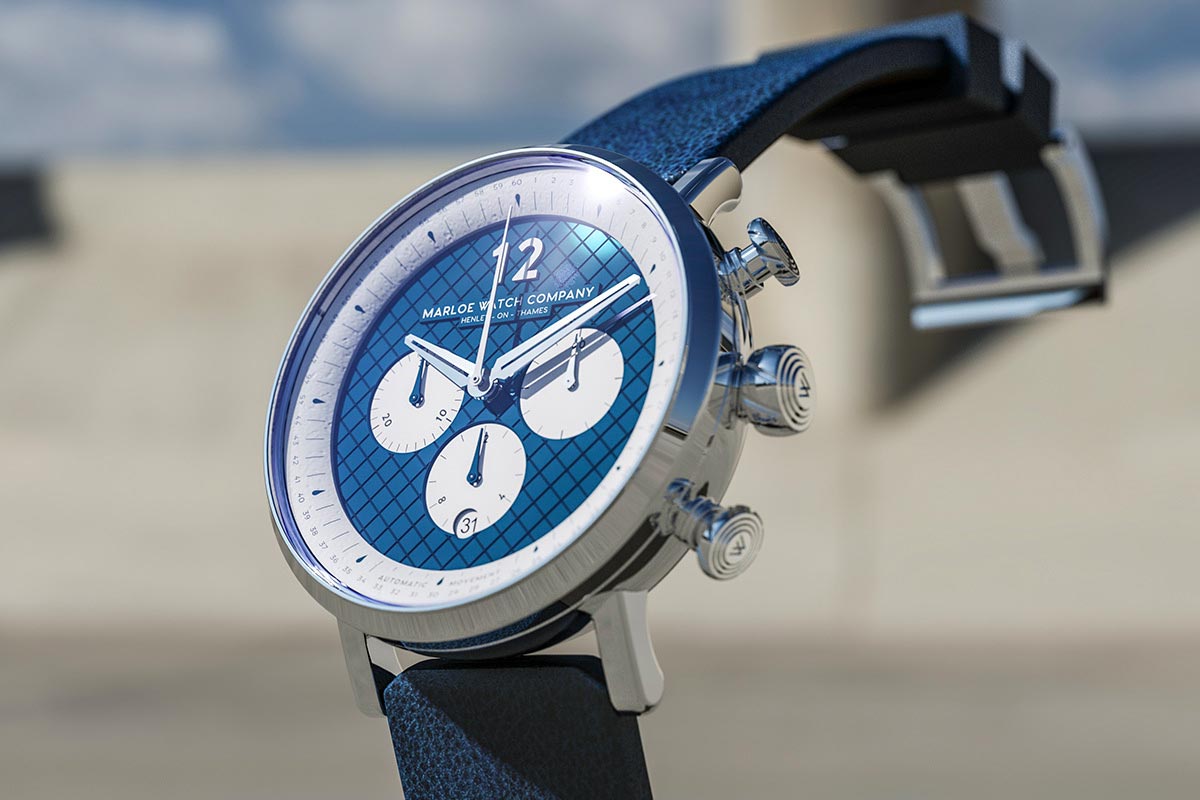
The idea was set - I would attempt to adapt the original project into an aviation-inspired range and use this beautiful shade of blue.
Which was exactly what happened. Not far from the Concorde and the Avro Vulcan, across the airfield from the Sopwith and the Tornado lies a small, unassuming bunker. Inside this bunker rests the entire historical remnants of the East Fortune Airship Station, and its role during the First World War. Pride of place, front and centre of this small bunker, is the story of the R34 Airship and its achievements. As you can read in this edition, the R34 was the first aircraft to make a return journey across the Atlantic, setting off from East Fortune, arriving at Mineola, New York, 108 hours later - returning to RNAS Pulham 72 hours after that. Crucially for me there were a few artifacts on display that intrigued. First was the colour of the Airship. Typically in all the historical photographs and drawings that you see of these giants of the skies, depict silver or white pristine elongated lozenges of hydrogen and metal. Yet the R34 was, as shown in the scale model and small patch of actual R34 outer skin, a luscious blue/green colour. How odd, I thought. I wondered if this is some artistic licence by the museum? Maybe the dopamine used to paint the envelope has oxidised? The story captivated me regardless and I headed home charged and excited to research the R34 further, and see if I could somehow garner inspiration and apply it to the almost dead-in-the-water project.
I emailed the museum of flight and was directed to the man in charge of the R34 exhibition, Ian Brown. I was enquiring about the colour, firstly, but also to see if there was a reason for it being this colour. With delight Ian replied:
“I can confirm the blue-painted linen is indeed genuine outer fabric from the R34 airship and this is indeed the colour the airship was painted. We believe it has oxidised over the years and is slightly darker than it would have been originally. The model displayed in the same case is contemporary and is very close to the true colour. I can, however, confirm that all images, drawings, books, etc, which depict the R34 as painted with silver dope (as were almost all other airships) are entirely wrong. The airship was not silver, it was most certainly not white, but was indeed painted blue. This is documented fact.”
The idea was set - I would attempt to adapt the original project into an aviation-inspired range and use this beautiful shade of blue. We decided, for obvious reasons, to call the project the Atlantic and it would use the rather wonderful Seiko NE88 movement - a high-end mechanical chronograph movement that was launched by the Japanese giant to compete with the Swiss offerings. When you are inspired and motivated in anything, the time to do things is suddenly shortened and things flow quicker than you can put them down on paper. I had in my mind’s eye the Atlantic design and its perfect iteration, and had things drawn up before the week closed out. How exciting it was to have found such an incredible story, a beautiful object and all within an hours drive from my house, if I fancied any more inspiration.
Inspiration and motivation turned slowly to frustration and exasperation. There’s nothing quite as corrosive to the soul as your vision of beauty being eaten away due to manufacturers inabilities or reluctances. Compromise after compromise, bounceback after bounceback. Over the course of another 4 months the Atlantic project had gone from a burning ember, to the first flicker of a fire, to a project that we were desperately trying to get to a conclusion with at least something intact from the original. Come early 2019 we had received our first prototypes and they were, to put it mildly, underwhelming. Oliver really liked them and I did too, but there was just something amiss. Proportion is a fickle mistress, especially when you are designing on a computer screen with the ability to zoom all the way in and see how things look close-up. Something about the Atlantic at this stage just didn’t sit right with me. It ate away at me silently and, coupled with reassurance from Oliver that it was just my tendency to fiddle, we carried on and developed the project further.
There’s a really interesting book called “Blink” by Malcom Gladwell. It discusses intuition and how we are able to make a snap decision in a blink of an eye, which more often than not is the correct decision. Yet at other times we deliberate and debate and analyse other decisions, which more often than not turn out to be the wrong decisions. He coins it “thin slicing” and it’s something I’ve really warmed to and a concept I have adopted fully, especially when deliberating with Oliver over something important. I’ll shout “thin slice” and we will decide there and then, more often than not the decision being the first solution we suggested.
Over the course of 2019 we had set the Morar project in place and production was going great. We had also concluded our Crowdcube funding campaign and it had, for the Atlantic project, problematic results. We had arranged a few open evenings where investors, potential or current, could come down and meet us, see what we are about and chat to us. It was a great way to pick the minds of people who would buy the Atlantic, and people with bold opinions. The overwhelming feeling was that the Atlantic prototypes, that were stationed in glass cabinets around our office, were beautiful and perfect and desired that very second. Yet I still wasn’t happy. Despite the positive feedback something continued to eat away and after a few more weeks of thinking about it, I decided the time had arrived to bring this disquiet to Oliver.
Once again Oliver tried to head off my discomfort with reassurance, but I was convinced. The Atlantic, if it were to succeed, needed a complete rehaul. A rethink from the ground up. A rehash. A new set of legs and some rocket fuel in the tank. With a good amount of heated debate and a fair amount of reluctance, Oliver agreed, but the money we had spent already to get these prototypes to the point they were at, as well as the re-prototyping of the 2nd iteration of the original concept, had cost us a lot. We didn’t want to throw all that away, but to rebuild this project would mean throwing it away.
The original was supposed to look like an engine cowling, but looked chunky and featureless instead.
It had to be done. I couldn’t live with myself if I saw the Atlantic launch as it stood and be criticised for all the things I knew were wrong with it, but didn’t want to change for fear of losing money or being held responsible. It was our name on the line here and I needed to sort it. I justified it as R&D costs and, over the course of an intensive week of late nights and headaches, I went back to the drawing board and designed a new case, more angular and aggressive. The original was supposed to look like an engine cowling but looked chunky and featureless instead. The new case looked purposeful and intentional, aviational and beautiful. It felt right. The biggest concern I had with the original design was the sub-dials and the proportions thereof. I had narrowed the issue down to the sub-dials being too small which caused a strange shift in perception. Generally quartz chronographs are easily identifiable for their sub-dials are small and clustered around the middle of the face - a byproduct of the generally small size of movements within these watches. The Atlantic looked just like that - centralised and clustered, and it meant our high end mechanical chronograph looked like a battery powered fashion watch. Not good enough. The dial design was re-engineered to give us two main sub-dials of substantially larger diameter, with a smaller central sub-dial for the chronograph hours. Immediately it felt right, akin to a painful dissonance gently resolving itself into a single note. The proportion was immediately in balance and aligned; it sang in harmony with the rest of the dial and I was elated.
Two weeks is all it took for the Atlantic project to be redesigned entirely, drawn up and documented in a revised Technical Document, and sent to our manufacturer. The excitement was palpable - I had finally resolved my long burning anxiety and soon everyone would also see how far it had come. We were approaching Christmas at that point and all going well, we would have this model in production come early 2020. A week passed with no response from our manufacturing partner. Two weeks passed with only a recognition that they had received the redesign and were discussing it with their team. Three weeks later we received the arrow through the heart. “The project is too complex. We are stepping away from it.” Stepping away? To where? Will you come back? It was incomprehensible, even more so after almost a year and a half of working with this manufacturer. All that effort, all that time and money. Merry Christmas.
What followed was a frantic search for a new partner who would be committed to making this technically challenging watch. We spoke with our contact at Seiko and asked them to recommend a partner to us - they offered us two names. The first flat-out denied the project, again on the basis of technicalities. The second contact did not. Instead, they praised our detailed Technical Document and said that they would come back to us with thoughts. Shortly before Christmas the project was greenlit and we quickly ironed out any issues and placed an order for prototypes. In late January as we unpacked our office in Perth, the prototypes arrived.
Not only were they spot on, direct physical incarnations of my design document, but they were even more fantastic in the metal. I knew right then, in that moment, that my decision to destroy the project and send us hurtling through the most dire of circumstances we’ve encountered so far, was the right call. Out of the burning embers of desperation, arose a phoenix of such beauty, of such potential that it was electrifying. I sat silently appraising these prototypes on the sofa in our new office, with Oliver next to me “ooo-ing” and “ahhh-ing” and I knew that the Atlantic was the right project to follow the Lomond. I knew that our Chronograph hopes had come through and that, finally, we had our Atlantic.
The prototypes had a small number of things that required tweaking, but as a whole these watches ticked every box I had personally set out for myself. From starting the project in May 2018 to receiving these prototypes in January 2020, the project had run the gamut. From excitedly sharing the first concept with Oliver, through the design phase and technical document preparation, through compromise and reluctant project shelving, to reincarnation as a chronograph, to absolute desperation and death. I’d been through it all, and dragged Oliver along with me. It resulted in a complete shift in my mental state, more often than not arriving at inadequacy and doubt. I went through one of the darkest periods I’ve been through as a designer - I can tell you that imposter syndrome is real and frightening. But from that journey we’ve received a belter of a design and I cannot wait to see production arrive, leave our office and be worn on the wrists of you all around the world.
That the project has been the most turbulent to date, that it has been one of the most challenging projects I’ve ever worked on, that it resonates with you all as much as the Lomond, is second only to the bitter-sweet joy of looking back and seeing how far we’ve come and how much experience I’ve gained from it. Long may it continue, but please, can we try to limit the swing from champagne-joy to smoldering death to a minimum.